Wednesday, November 30, 2011

Flip or Reverse Text Using CSS

As title says, we can Flip Text Upside Down or Reverse Text using CSS only(Rather than some jQuery Plugin or JavaScript). The CSS is completely Cross-browser compatible(Yeah, even older IEs), check out the CSS below

Flipping Text Upside Down

#div {
-webkit-transform:rotate(-180deg);
-moz-transform:rotate(-180deg);
-o-transform:rotate(-180deg);
transform:rotate(-180deg);
ms-filter:"progid:DXImageTransform.Microsoft.BasicImage(rotation=2)";
filter:progid:DXImageTransform.Microsoft.BasicImage(rotation=2);
}


Reversing Text CSS

#div {
direction: rtl;
unicode-bidi: bidi-override;
}

Wednesday, November 2, 2011

Designing For Android

For designers, Android is the elephant in the room when it comes to app design. As much as designers would like to think it’s an iOS world in which all anyones cares about are iPhones, iPads and the App Store, nobody can ignore that Android currently has the majority of smartphone market share and that it is being used on everything from tablets to e-readers. In short, the Google Android platform is quickly becoming ubiquitous, and brands are starting to notice.
But let’s face it. Android’s multiple devices and form factors make it feel like designing for it is an uphill battle. And its cryptic documentation is hardly a starting point for designing and producing great apps. Surf the Web for resources on Android design and you’ll find little there to guide you.
If all this feels discouraging (and if it’s the reason you’re not designing apps for Android), you’re not alone. Fortunately, Android is beginning to address the issues with multiple devices and screen sizes, and device makers are slowly arriving at standards that will eventually reduce complexity.
This article will help designers become familiar with what they need to know to get started with Android and to deliver the right assets to the development team. The topics we’ll cover are:
  • Demystifying Android screen densities,
  • Learning the fundamentals of Android design via design patterns,
  • Design assets your developer needs,
  • How to get screenshots,
  • What Android 3 is about, and what’s on the horizon.
[Editor's note: A must-have for professional Web designers and developers: The Printed Smashing Books Bundle is full of practical insight for your daily work. Get the bundle right away!]

Android Smartphones And Display Sizes

When starting any digital design project, understanding the hardware first is a good idea. For iOS apps, that would be the iPhone and iPod Touch. Android, meanwhile, spans dozens of devices and makers. Where to begin?
The old baseline for screens supported for Android smartphone devices was the T-Mobile G1, the first commercially available Android-powered device which has an HVGA screen measuring 320 x 480 pixels.
HVGA stands for “half-size video graphics array” (or half-size VGA) and is the standard display size for today’s smartphones. The iPhone 3GS, 3G and 2G use the same configuration.
Screenshot
T-Mobile G1, the first commercially available Android device and the baseline for Android screen specifications.
To keep things simple, Android breaks down physical screen sizes (measured as the screen’s diagonal length from the top-left corner to bottom-right corner) into four general sizes: small, normal, large and xlarge.
Screenshot
Two common Android screen sizes. (Image from Google I/O 2010)
320 × 480 is considered a “normal” screen size by Android. As for “xlarge,” think tablets. However, themost popular Android smartphones today have WVGA (i.e. wide VGA) 800+ × 480-pixel HD displays. So, what’s “normal” is quickly changing. For now, we’ll say that most Android smartphones have large screens.
Screenshot
Diagram of various screen configurations available from emulator skins in the Android SDK. (Image: Android Developers website)
The variety of display sizes can be challenging for designers who are trying to create one-size-fits-all layouts. I’ve found the best approach is to design one set of layouts for 320 x 533 physical pixels and then introduce custom layouts for the other screen sizes.
While this creates more work for both the designer and developer, the larger physical screen size on bigger devices such as the Motorola Droid and HTC Evo might require changes to the baseline layouts that make better use of the extra real estate.

What You Need to Know About Screen Densities

Screen sizes are only half the picture! Developers don’t refer to a screen’s resolution, but rather its density. Here’s how Android defines the terms in its Developers Guide:
  • Resolution
    The total number of physical pixels on a screen.
  • Screen density
    The quantity of pixels within a physical area of the screen, usually referred to as DPI (dots per inch).
  • Density-independent pixel (DP)
    This is a virtual pixel unit that you would use when defining a layout’s UI in order to express the layout’s dimensions or position in a density-independent way. The density-independent pixel is equivalent to one physical pixel on a 160 DPI screen, which is the baseline density assumed by the system of a “medium”-density screen. At runtime, the system transparently handles any scaling of the DP units as necessary, based on the actual density of the screen in use. The conversion of DP units to screen pixels is simple: pixels = DP * (DPI / 160). For example, on a 240 DPI screen, 1 DP equals 1.5 physical pixels. Always use DP units when defining your application’s UI to ensure that the UI displays properly on screens with different densities.
It’s a bit confusing, but this is what you need to know: Like screen sizes, Android divides screen densities into four basic densities: ldpi (low), mdpi (medium), hdpi (high), and xhdpi (extra high). This is important because you’ll need to deliver all graphical assets (bitmaps) in sets of different densities. At the very least, you’ll need to deliver mdpi and hdpi sets for any smartphone apps.
What this means is all bitmap graphics need to be scaled up or down from your baseline (320 x 533) screen layouts (note: there is also a way for parsing SVG files that provides a way to scale vector art on different screens sizes and densities without loss of image quality).
The bitmap requirement is similar to preparing graphics for print vs. the Web. If you have any experience with print production, you’ll know that a 72 PPI image will look very pixelated and blurry when scaled up and printed. Instead, you would need to redo the image as a vector image or use a high-resolution photo and then set the file’s resolution at around 300 PPI in order to print it without any loss of image quality. Screen density for Android works similar, except that we’re not changing the file’s resolution, only the image’s size (i.e. standard 72 PPI is fine).
Let’s say you took a bitmap icon measuring 100 × 100 pixels from one of the screens of your baseline designs (remember the “baseline” is a layout set at 320 × 480). Placing this same 100 × 100 icon on a device with an lDPI screen would make the icon appear big and blurry. Likewise, placing it on a device with an hDPI screen would make it appear too small (due to the device having more dots per inch than the mDPI screen).
Screenshot
An application without density support. (Image: Android Developers website)
To adjust for the different device screen densities, we need to follow a 3:4:6:8 scaling ratio between the four density sizes. (For the iPhone, it’s easy: it’s just a 2:1 ratio between the iPhone 4 and 3GS.) Using our ratios and some simple math, we can create four different versions of our bitmap to hand off to our developer for production:
  • 75 × 75 for low-density screens (i.e. ×0.75);
  • 100 × 100 for medium-density screens (our baseline);
  • 150 × 150 for high-density screens (×1.5);
  • 200 × 200 for extra high-density screens (×2.0). (We’re concerned with only lDPI, mDPI and hDPI for Android smartphone apps.)
Screenshot
The final graphic assets would appear like this using the four different screen densities.
After you’ve produced all of your graphics, you could organize your graphics library as follows:
Screenshot
The suggested organization and labeling of asset folders and files. In preparing our star graphic, all file prefixes could be preceded by the name ic_star, without changing the names of the respective densities.
You might be confused about what PPI (pixels per inch) to set your deliverables at. Just leave them at the standard 72 PPI, and scale the images accordingly.

Using Android Design Patterns

Clients often ask whether they can use their iPhone app design for Android. If you’re looking for shortcuts, building an app for mobile Web browsers using something like Webkit and HTML5 is perhaps a better choice. But to produce a native Android app, the answer is no. Why? Because Android’s UI conventions are different from iPhone’s.
The big difference is the “Back” key, for navigating to previous pages. The Back key on Android devices is fixed and always available to the user, regardless of the app. It’s either a physical part of the device or digitally fixed to the bottom of the screen, independent of any app, as in the recently released Android 3.0 for tablets (more on this later).
Screenshot
The hard “Back” key on a smartphone running Android 2.0.
The presence of a Back key outside of the app itself leaves space for other elements at the top of the screen, such as a logo, title or menu. While this navigational convention differs greatly from that of iOS, there are still other differentiators that Android calls “design patterns.” According to Android, a design pattern is a “general solution to a recurring problem.” Below are the main Android design patterns that were introduced with version 2.0.

Dashboard

This pattern solves the problem of having to navigate to several layers within an app. It provides a launch pad solution for rich apps such as Facebook, LinkedIn and Evernote.
Screenshot
The dashboard design pattern, as used by Facebook and LinkedIn.

Action Bar

The action bar is one of Android’s most important design patterns and differentiators. It works very similar to a conventional website’s banner, with the logo or title typically on the left and the navigation items on the right. The action bar’s design is flexible and allows for hovering menus and expanding search boxes. It’s generally used as a global feature rather than a contextual one.
Screenshot
The action bar design pattern as used by Twitter.

Search Bar

This gives the user a simple way to search by category, and it provides search suggestions.
Screenshot
The search bar design pattern as used in the Google Search app.

Quick Actions

This design pattern is similar to iOS’ pop-up behavior that gives the user additional contextual actions. For example, tapping a photo in an app might trigger a quick action bar that allows the user to share the photo.
Screenshot
The quick action design pattern as used by Twitter.

Companion Widget

Widgets allow an app to display notifications on the user’s launch screen. Unlike push notifications in iOS, which behave as temporary modal dialogs, companion widgets remain on the launch screen. (Tip: to select a widget for your Android device, simply tap and hold any empty space on one of the launch screens.)
Screenshot
Companion widgets by Engadget, New York Times and Pandora.
Using established design patterns is important for keeping the experience intuitive and familiar for your users. Users don’t want an iPhone experience on their Android device any more than a Mac user wants a Microsoft experience in their Mac OS environment. Understanding design patterns is the first step to learning to speak Android and designing an optimal experience for its users. Your developers will also thank you!

Android Design Deliverables

OK, so you’ve designed your Android app and are ready to make it a reality. What do you need to hand off to the developer? Here’s a quick list of deliverables:
  1. Annotated wireframes of the user experience based on the baseline large screen size of 320 x 533 physical pixels. Include any additional screens for instances where a larger or smaller (320 x 480) screen size requires a modified layout or a landscape version is required.
  2. Visual design mockups of key screens for WVGA large size (320 x 533) screens (based on a WVGA 800 x 480 hdpi physical pixel screen size) in addition to any custom layouts needed for other screen sizes.
  3. Specifications for spacing, font sizes and colors, and an indication of any bitmaps.
  4. A graphics library with lDPI, mDPI and hDPI versions of all bitmaps saved as transparent PNG files.
  5. Density-specific app icons, including the app’s launch icon, as transparent PNG files. Android already provides excellent tips for designers on this topic, along with some downloads, including graphic PSD templates and other goodies.

How To Take Screenshots

Your product manager has just asked for screenshots of the developer’s build. The developer is busy and can’t get them to you until tomorrow. What do you do?! As of this writing, Android has no built-in way to take screenshots (bummer, I know). The only way is to just deal with it, and that means pretending to be a developer for a while and downloading some really scary software. Let’s get started!
The following software must be downloaded:
  1. All USB drivers for your Android device,
  2. Android software development kit (SDK),
  3. Java SE SDK
Then, on your computer:
  1. Extract the USB drivers to a folder on your desktop,
  2. Extract the Android SDK to a folder on your desktop,
  3. Install the Java SE SDK.
On your Android device:
  1. Open “Settings” (you’ll find it in the apps menu),
  2. Tap on “Applications,”
  3. Tap on “Development,”
  4. Check the box for “USB debugging.”
Screenshot
Now, for the fun part:
  1. Connect your Android device to your computer via USB. Windows users: allow Windows to install all drivers. One of the drivers may not be found and will require you to go to the Window’s Device Manager under the Control Panel. There, you can locate the device (having a yellow warning icon next to it) and right-click on it.
  2. Choose to “update/install” the driver for your device.
  3. Go to your desktop. Open the Android SDK folder and select SDK Setup.exe.
  4. Allow it to automatically refresh its list of the operating system SDKs that are available, and select to install all packages.
  5. Once finished, exit the application.
  6. Go back to the opened Android SDK folder on your desktop, and open the “Tools” folder.
  7. Click on the file ddms to open the Dalvik Debug Monitor.
  8. Select your device from the “Name” pane.
  9. In the application’s top menu, open the “Device” menu, and choose “Screen capture…” A Device Screen Capture window will open, and you should see the launch screen of your Android device.
Screenshot
The Dalvik Debut Monitor.
To navigate:
  1. Grab your Android device and navigate to any page. Go back to your computer and select “Refresh” in the Device Screen Capture window. The current screen from your Android device should appear.
  2. If you’re on a Mac, you can just do the old Shift + Command + 4 trick to take a screenshot. In Windows, you can copy and paste it into one of the Windows media applications.

About Android Tablets

At CES 2011, companies rained down Android tablets, with an array of screen sizes. However, after a quick review of the most popular ones, we can conclude that the two important screen sizes to focus on in terms of physical pixels are 1280 × 800 and 800 × 480.
With the Android 3.0 Honeycomb release, Google provided device makers with an Android UI made for tablets. Gone is the hard “Back” button, replaced by an anchored software-generated navigation and system status bar at the bottom of the screen.
Screenshot
The anchored navigation and system bar in Android 3.0.
Android 3.0 got a visual refresh, while incorporating all of the design patterns introduced in Android 2.0. One of the major differences with 3.0 is the Action Bar which has been updated to include tabs, drop-down menus or breadcrumbs. The action bar can also change its appearance to show contextual actions when the user selects single or multiple elements on a screen.
Screenshot
The new action bar with tabs, introduced in Android 3.0.
Another new feature added to the Android framework with 3.0 is a mechanism called “fragments.” A fragment is a self-contained component in a layout that can change size and position depending on the screen’s orientation and size. This further addresses the problem of designing for multiple form factors by giving designers and developers a way to make their screen layout components elastic and stackable, depending on the screen limitations of the app. Screen components can be stretched, stacked, expanded and collapsed, and revealed and hidden.
Screenshot
Diagram showing examples of how fragments can be used.
The next Android release, scrumptiously dubbed Ice Cream Sandwich, promises to bring this functionality to Android smartphones as well, giving designers and developers the option to build an app using a one-size-fits-all strategy. This could be a paradigm shift for designers and developers, who will need to learn to think of app design in terms of puzzle pieces that can be stretched, stacked, expanded or hidden to fit the form factor. In short, this will allow one Android OS to run anywhere (with infinite possibilities!).

A Word of Advice

Do get your hands on an Android phone and tablet, and spend some time downloading apps and exploring their interfaces. In order to design for Android, you have to immerse yourself in the environment and know it intimately. This might sound obvious, but it’s always surprising to hear when even the product manager doesn’t have an Android device.
Screenshot

Online Resources

Here are some links to online resources I’ve found especially useful:

Presentations

Videos

Documents

Blogs

Product Reviews

Android Developers

Other

Tuesday, October 4, 2011

20 HTML Best Practices You Should Follow

Most of the web pages you encounter is presented to you via HTML, the world wide web’s markup language. In this article, I will share with you 20 best practices that will lead to clean and correct markup.

1. Always Declare a Doctype

The doctype declaration should be the first thing in your HTML documents. The doctype declaration tells the browser about the XHTML standards you will be using and helps it read and render your markup correctly.
I would recommend using the XHTML 1.0 strict doctype. Some developers consider it a tough choice because this particular standard is less forgiving than loose or transitional doctype declarations, but it also ensures that your code abides strictly by the latest standards.
<!DOCTYPE html PUBLIC "-//W3C//DTD XHTML 1.0 Strict//EN" "http://www.w3.org/TR/xhtml1/DTD/xhtml1-strict.dtd">

2. Use Meaningful Title Tags

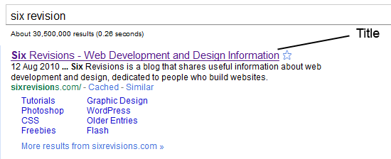
The <title> tag helps make a web page more meaningful and search-engine friendly. For example, the text inside the <title> tag appears in Google’s search engine results page, as well as in the user’s web browser bar and tabs.
Take for instance, the following example:
<title>Six Revisions - Web Development and Design Information</title>
The example above appears like the following image in Google’s search engine results page:

3. Use Descriptive Meta Tags

Meta tags make your web page more meaningful for user agents like search engine spiders.

Description Meta Attribute

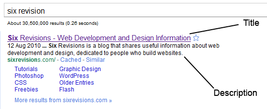
The description meta attribute describes the basic purpose of your web page (a summary of what the web page contains). For each web page, you should place a consise and relevant summary inside the meta description tag.
For example, this description:
<meta name="description" content="Six Revisions is a blog that shares useful information about web development and design, dedicated to people who build websites." />
Shows up in Google’s search engine results page as follows:
Don’t try to spam your description with repeated words and phrases because search engines are intelligent enough to detect that. Instead, just try to be simple and straightforward in explaining the purpose of your web page.

Keywords Meta Attribute

<meta name="keywords" content="web design, web development" />
The keywords meta attribute contains a comma-separated list of key words and phrases that relate to your web page. These keywords make your web page even more meaningful.
Again, just like with the description meta attribute, avoid repetition of words and phrases; just mention a few words that aptly describes and categorizes your web page.

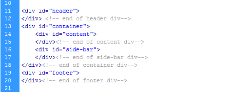
4. Use Divs to Divide Your Layout into Major Sections

Consider dividing your web page into major sections as the first step in constructing a website design.
Doing so from the start promotes clean and well-indented code. It will also help you avoid confusion and excess use of divs, especially if you are writing complex and lengthy markup.

5. Separate Content from Presentation

Your HTML is your content. CSS provides your content’s visual presentation. Never mix both.
Don’t use inline styles in your HTML. Always create a separate CSS file for your styles. This will help you and future developers that might work on your code make changes to the design quicker and make your content more easily digestible for user agents.

Bad Practice: Inline Styles

Below, you can see a paragraph element that is styled using the style attribute. It will work, but it’s bad practice.
<p style="color:#abc; font-size:14px; font-family:arial,sans-serif;">I hate to separate my content from presentation</p>

6. Minify and Unify CSS

A simple website usually has one main CSS file and possibly a few more for things likeCSS reset and browser-specific fixes.
But each CSS file has to make an HTTP request, which slows down website load times.
A solution to this problem is to minify (take out unneeded characters such as spaces, newlines, and tabs) all your code and try to unify files that can be combined into one file. This will improve your website load times.
A problem with this approach is that you have to "unminify" (because it’s hard to read unformatted code) and then redo the minification process every time you need to update your code. So it’s better to do this at the end of your production cycle.
Online tools to minify and optimize CSS can be found on this list of CSS optimizers.
Also, always put your stylesheet reference link inside the <head></head> tags because it will help your web page feel more responsive while loading.

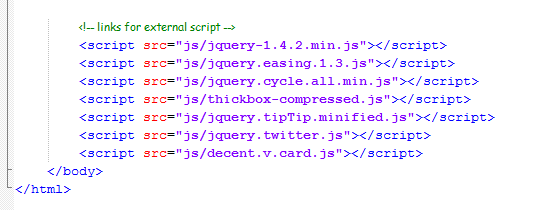
7. Minify, Unify and Move Down JavaScript

Like CSS, never use inline JavaScript and try to minify and unify your JavaScript libraries to reduce the number of HTTP requests that need to be made in order to generate one of your web pages.
But unlike CSS, there is one really bad thing about external JavaScript files: browsers do not allow parallel downloads, which means the browser cannot download anything while it’s downloading JavaScript, resulting in making the page feel like it’s loading slowly.
So, the best strategy here is to load JavaScript last (i.e. after your CSS is loaded). To do this, place JavaScript at the bottom of your HTML document where possible. Best practice recommends doing this right before the closing <body> tag.

Example

Minify, Unify and Move Down JavaScript

8. Use Heading Elements Wisely

Learn to use <h1> to <h6> elements to denote your HTML’s content hierarchy. This helps make your content more meaningful for screen-reading software and search engines, as well as other user agents.

Example

<h1>This is the topmost heading</h1>
<h2>This is a sub-heading underneath the topmost heading.</h2>
<h3>This is a sub-heading underneath the h2 heading.</h3>
For blogs, I really recommend using the <h1> element for the blog post’s title instead of the site’s name because this is the most important thing for search engines.

WordPress Code Example

<h1 class="entry-title"><?php the_title(); ?></h1>

9.Use the Right HTML Element at the Right Place

Learn about all the available HTML elements and use them correctly for a semantic and meaningful content structure.
Use <em> for emphasis and <strong> for heavy emphasis, instead of <i> or <b>(which are deprecated).

Example

<em>emphasized text</em>
<strong>strongly emphasized text</strong>  
Use <p> for paragraphs. Don’t use <br /> to add a new line between paragraphs; use CSS margin and/or padding properties instead.
For a set of related elements, use:
  • <ul> (unordered lists) when the order of the list items are not important
  • <ol> (ordered lists) when the order of the list items are important
  • <dl> (definition lists) for item/definition pairs
Don’t use <blockquote> for indentation purposes; use it when actually quoting text.

10. Don’t Use Divs for Everything

Sometimes developers end up wrapping <div> tags around multiple <div> tags that contain more <div> tags, creating a mountain of divs.
Under the latest draft of the W3C HTML specification, a <div> is a meaningless element that should be used "as an element of last resort, for when no other element is suitable."
But many use it even for menial things like displaying inline elements as block elements (instead of the display:block; CSS property).
Avoid creating mountains of divs by using them sparingly and responsibly.

11. Use an Unordered List (<ul>) for Navigation

Navigation is a very important aspect of a website design and the <ul> element combined with CSS makes your navigation menus semantic (because, after all, a navigation menu is a list of links) as well as beautiful.
Also, by convention, an unordered list for your navigation menu has been the accepted markup.

An Example of an Unordered List

<ul id="main_nav">
<li><a href="#" class="active">Home</a></li>
<li><a href="#">About</a></li>
<li><a href="#">Portfolio</a></li>
<li><a href="#">Services</a></li>
<li><a href="#">Blog</a></li>
<li><a href="#">Contact Us</a></li>
</ul>

CSS to Style the Unordered List into a Horizontal Navigation Bar

#main_nav { position:absolute; right:30px; top:40px;}
       #main_nav li { float:left; margin-left:2px; }
       #main_nav li a{ font-size:16px; color:#fff; text-decoration:none; padding:8px 15px; -moz-border-radius:7px; -webkit-border-radius:7px; border-radius:7px;}
       #main_nav li a.active,
     #main_nav li a:hover{  background-color:#0b86cb;  }

Output

Use an Unordered List (<ul>) for Navigation

12. Close Your Tags

Closing all your tags is a W3C specification. Some browsers may still render your pages correctly (under Quirks mode), but not closing your tags is invalid under standards.

Example

<div id="test">
<img src="images/sample.jpg" alt="sample" />
<a href="#" title="test">test</a>
<p>some sample text </p>
</div>

13. Use Lower Case Markup

It is an industry-standard practice to keep your markup lower-cased. Capitalizing your markup will work and will probably not affect how your web pages are rendered, but it does affect code readability.

Bad Practice

<DIV>
<IMG SRC="images/sample.jpg" alt="sample"/>
<A HREF="#" TITLE="TEST">test</A>
<P>some sample text</P>
</DIV>

Good Practice

<div id="test">
<img src="images/sample.jpg" alt="sample" />
<a href="#" title="test">test</a>
<p>some sample text </p>
</div>

14. Use Alt Attributes with Images

Using a meaningful alt attribute with <img> elements is a must for writing valid and semantic code.

Bad Practice

<img id="logo" src="images/bgr_logo.png"/>
<!-- has an alt attribute, which will validate, but alt value is meaningless -->
<img id="logo" src="images/bgr_logo.png" alt="brg_logo.png" />

Good Practice

<img id="logo" src="images/bgr_logo.png" alt="Six Revisions Logo" />

15.Use Title Attributes with Links (When Needed)

Using a title attribute in your anchor elements will improve accessibility when used the right way.
It is important to understand that the title attribute should be used to increase the meaning of the anchor tag.

Bad Practice

<!-- Redundant title attribute -->
<a href="http://blog.com/all-articles" title="Click Here">Click here.</a>
When a screen reader reads the anchor tag, the listener has to listen to the same text twice. What’s worse is that it doesn’t explain what the page being linked to is.
If you are just repeating the anchor’s text or aren’t intending to describe the page being linked, it’s better not to use a title at all.

Good Practice

<a href="http://blog.com/all-articles" title="A list of all articles.">Click here.</a>

16. Use Fieldset and Labels in Web Forms

Use the <label> element to label input fields. Divide input fields into logical sets using<fieldset>. Name a <fieldset> using <legend>. All of this will make your forms more understandable for users and improve the quality of your code.

Example

<fieldset>
    <legend>Personal Details</legend>
    <label for="name">name</label><input type="text" id="name" name="name" />
    <label for="email">email</label><input type="text" id="email" name="email" />
    <label for="subject">subject</label><input type="text" id="subject" name="subject" />
    <label for="message" >message</label><textarea rows="10" cols="20" id="message" name="message" ></textarea>
</fieldset>

17.Use Modular IE Fixes

You can use conditional comments to target Internet Explorer if you are having issues with your web pages.

IE 7 Example

<!--[if IE 7]>
<link rel="stylesheet" href="css/ie-7.css" media="all">
<![endif]-->

IE 6 Example

<!--[if IE 6]>
<link rel="stylesheet" href="css/ie-6.css" media="all">
<script type="text/javascript" src="js/DD_belatedPNG_0.0.8a-min.js"></script>
<script type="text/javascript">
        DD_belatedPNG.fix('#logo');
      </script>
<![endif]-->
However, try to make your fixes modular to future-proof your work such that when older versions of IE don’t need to be supported anymore, you just have to update your site in one place (i.e. take out the reference to the ie-6.css stylesheet).
By the way, for pixing PNG transparencies in IE6, I recommend the DD_belated PNG script (the JavaScript method referenced above).

18.Validate Your Code

Validation should not be the end-all evaluation of good work versus bad work. Just because your work validates doesn’t automatically mean it’s good code; and conversely, a work that doesn’t fully validate doesn’t mean it’s bad (if you don’t believe me, try auto-validating Google or Yahoo!).
But auto-validation services such as the free W3C markup validation service can be a useful debugger that helps you identify rendering errors.
While writing HTML, make a habit to validate frequently; this will save you from issues that are harder to pinpoint (or redo) once your work is completed and lengthier.

19. Write Consistently Formatted Code

A cleanly written and well-indented code base shows your professionalism, as well as your consideration for the other people that might need to work on your code.
Write properly indented clean markup from the start; it will increase your work’s readability.

20. Avoid Excessive Comments

While documenting your code, the purpose is to make it easier to understand, so commenting your code logic is a good thing for programming languages like PHP, Java and C#.
But markup is very much self-explanatory and commenting every line of code does not make sense in HTML/XHTML. If you find yourself commenting your HTML a lot to explain what is going on, you should review your work for semantics and appropriate naming conventions.