Front-end Code Standards & Best Practices
Overview
This document contains guidelines for web applications built by the Creative Technology (front end engineering) practice of Isobar US. It is to be readily available to anyone who wishes to check the iterative progress of our best practices. If you have any feedback, please leave a comment on the announcement blog post. This document's primary motivation is two- fold: 1) code consistency and 2) best practices. By maintaining consistency in coding styles and conventions, we can ease the burden of legacy code maintenance, and mitigate risk of breakage in the future. By adhering to best practices, we ensure optimized page loading, performance and maintainable code.
General Guidelines
Pillars of Front-end Development
1. Separation of presentation, content, and behavior.
General Practices
Indentation
For all code languages, we require indentation to be done via soft tabs (using the space character). HittingTab in your text editor shall be equivalent to four spaces.
Readability vs Compression
We prefer readability over file-size savings when it comes to maintaining existing files. Plenty of whitespace is encouraged, along with ASCII art, where appropriate. There is no need for any developer to purposefully compress HTML or CSS, nor obfuscate JavaScript.
We will use server-side or build processes to automatically minify and gzip all static client-side files, such as CSS and JavaScript.
Markup
The first component of any web page is the tag-based markup language of HTML. The Hyper Text Markup Language (HTML) has a sordid history but has come into its own in the last few years. After a lengthy experimentation with the XML-based XHTML variant the industry has accepted that HTML is the future of the web.
Markup defines the structure and outline of a document and offers a structured content. Markup is not intended to define the look and feel of the content on the page beyond rudimentary concepts such as headers, paragraphs, and lists. The presentation attributes of HTML have all been deprecated and style should be contained in style sheets. HTML5
HTML5 is a new version of HTML and XHTML. The HTML5 draft specification defines a single language that can be written in HTML and XML. It attempts to solve issues found in previous iterations of HTML and addresses the needs of web Applications, an area previously not adequately covered by HTML. (source). We will use the HTML5 Doctype and HTML5 features when appropriate.
We will test our markup against the W3C validator, to ensure that the markup is well formed. 100% valid code is not a goal, but validation certainly helps to write more maintainable sites as well as debugging code.Isobar does not guarantee code is 100% valid, but instead assures the cross-browser experience is fairly consistent. Template
Doctype
A proper Doctype which triggers standards mode in your browser should always be used. Quirks mode should always be avoided.
A nice aspect of HTML5 is that it streamlines the amount of code that is required. Meaningless attributes have been dropped, and the DOCTYPE declaration has been simplified significantly. Additionally, there is no need to use CDATA to escape inline JavaScript, formerly a requirement to meet XML strictness in XHTML.
HTML5 Doctype
1.<!DOCTYPE html>
Character Encoding
All markup should be delivered as UTF-8, as its the most friendly for internationalization. It should be designated in both the HTTP header and the head of the document.
Setting the character set using <meta> tags.
1.<meta http-equiv="Content-Type" content="text/html; charset=UTF-8" />
In HTML5, just do:
1.<meta charset="utf-8">
General Markup Guidelines
The following are general guidelines for structuring your HTML markup. Authors are reminded to always use markup which represents the semantics of the content in the document being created.
· Use actual P elements for paragraph delimiters as opposed to multiple BR tags.
· Make use of DL (definition lists) and BLOCKQUOTE, when appropriate.
· Items in list form should always be housed in a UL, OL, or DL, never a set of DIVs or Ps.
· Use label fields to label each form field, the for attribute should associate itself with the input field, so users can click the labels. cursor:pointer; on the label is wise, as well. note 1 note 2 · Do not use the size attribute on your input fields. The size attribute is relative to the font-size of the text inside the input. Instead use css width.
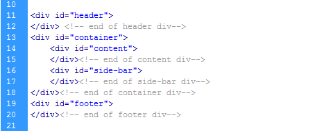
· Place an html comment on some closing div tags to indicate what element you're closing. It will help when there is lots of nesting and indentation.
· Tables shouldn't be used for page layout.
· Use microformats and/or Microdata where appropriate, specifically hCard and adr. · Make use of THEAD, TBODY, and TH tags (and Scope attribute) when appropriate.Table markup with proper syntax (THEAD,TBODY,TH [scope])
01.<table summary="This is a chart of year-end returns for 2005.">
02.<thead>
03.<tr>
04.<th scope="col">Table header 1</th>
05.<th scope="col">Table header 2</th>
06.</tr>
07.</thead>
08.<tbody>
09.<tr>
10.<td>Table data 1</td>
11.<td>Table data 2</td>
12.</tr>
13.</tbody>
14.</table>
· Always use title-case for headers and titles. Do not use all caps or all lowercase titles in markup, instead apply the CSS property text-transform:uppercase/lowercase.
Quoting Attributes
While the HTML5 specification defines quotes around attributes as optional for consistency with attributes that accept whitespace, all attributes should be quoted.
1.<p class="line note" data-attribute="106">This is my paragraph of special text.</p>
CSS
The second component of a web page is the presentation information contained in the Cascading Style Sheet (CSS.) Web browsers successful implementation of CSS has given a whole generation of web authors site-wide control over the look and feel of their web sites.
Just as the information on a web page is semantically described in the HTML Markup, CSS describes all presentation aspects of the page via a description of it's visual properties. CSS is powerful in that these properties are mixed and matched via identifiers to control the page's layout and visual characteristics through the layering of style rules (the "cascade"). General Coding Principles
· Add CSS through external files, minimizing the # of files, if possible. It should always be in the HEAD of the document.
1.<link rel="stylesheet" type="text/css" href="myStylesheet.css" />
Don't use inline styling
1.<p style="font-size: 12px; color: #FFFFFF">This is poor form, I say</p>
· Don't include styles inline in the document, either in a style tag or on the elements. It's harder to track down style rules.
· Use a reset CSS file (like the one present in H5BP or the Eric Meyers reset) to zero our cross-browser weirdness. · Elements that occur only once inside a document should use IDs, otherwise, use classes.
· Write selectors that are optimized for speed. Where possible, avoid expensive CSS selectors. For example, avoid the * wildcard selector and don't qualify ID selectors (e.g. div#myid) or class selectors (e.g. table.results.) This is especially important with web applications where speed is paramount and there can be thousands or even tens of thousands of DOM elements. More on writing efficient CSS on the MDC. CSS Box Model
Intimate knowledge and understanding of the CSS and browser-based box model is necessary for conquering the fundamentals of CSS layouts.
CSS Validation
CSS Formatting
At minimum, format CSS with selectors on one line and each property on its own line. The declarations are indented.
As an enhancement to that style, related or child styles and additional 2 or 4 spaces. That allows for hierarchical scanning and organization and makes (for some people) an easier-to-read style sheet.
01..post-list li a{
02.color:#A8A8A8;
03.}
04..post-list li a:hover{
05.color:#000;
06.text-decoration:none;
07.}
08..post-list li .author a, .post-list li .author a:hover{
09.color:#F30;
10.text-transform:uppercase;
11.}
For multiple author environments, single line CSS should be avoided because it can cause issues with version control.
Alphabetize
Classes vs. IDs
You should only give elements an ID attribute if they are unique. They should be applied to that element only and nothing else. Classes can be applied to multiple elements that share the same style properties. Things that should look and work in the same way can have the same class name.
1.<ul id="categories">
2.<li class="item">Category 1</li>
3.<li class="item">Category 2</li>
4.<li class="item">Category 3</li>
5.</ul>
Naming Conventions for Selectors
It is always preferable to name something, be it an ID or a class, by the nature of what it is rather than bywhat it looks like. For instance, a class name of bigBlueText for a special note on a page is quite meaningless if it has been changed to have a small red text color. Using a more intelligent convention such asnoteText is better because when the visual style changes it still makes sense.
Selectors
Pseudo-classes
Pseudo-classes enable you to dynamically style content. Some pseudo-classes have existed since CSS1 (:visited, :hover, etc.) and CSS2 (:first-child, :lang). As of CSS3, 16 new pseudo-classes have been added to the list and are especially useful for styling dynamic content. Learn how to use pseudo-classes in-depth. Combinators & Attribute Selectors
Combinators provide shortcuts for selecting elements that are a descendant element, a child element, or an element's sibling. Attribute Selectors are great for finding elements that have a specific attribute and/or specific value. Knowledge of regular expressions helps with attribute selectors. Specificity
Browsers calculate a selector's specificity to determine which CSS rule should apply. If two selectors apply to the same element, the one with the higher specificity wins. IDs have a higher specificity than attribute selectors do, and class selectors have higher specificity than any number of element selectors. Always try to use IDs to increase the specificity. There are times when we may try to apply a CSS rule to an element and it does not work no matter what we try. This is likely because the specificity of the selector used is lower than another one and the properties of the higher one are taking precedence over those you want to apply. This is more common in working with larger more complex stylesheets. It isn't a big issue with smaller projects usually.
Calculating specifity
When working with a large and complex stylesheet it helps to know how to calculate the value of a selector's specificity, to save you time and to make your selectors more efficient.
Specificity is calculated by counting various components of your CSS and expressing them in a form (a,b,c,d).
· Element, Pseudo Element: d = 1 – (0,0,0,1)
· Class, Pseudo class, Attribute: c = 1 – (0,0,1,0)
· Id: b = 1 – (0,1,0,0)
· Inline Style: a = 1 – (1,0,0,0)
However, it may be better to use a specificity calculator.
Using !important overrides all specificity no matter how high it is. We like to avoid using it for this reason. Most of the time it is not necessary. Even if you need to override a selector in a stylesheet you don't have access to, there are usually ways to override it without using !important. Avoid using it if possible.
Pixels vs. Ems
We use the px unit of measurement to define font size, because it offers absolute control over text. We realize that using the em unit for font sizing used to be popular, to accommodate for Internet Explorer 6 not resizing pixel based text. However, all major browsers (including IE7 and IE8) now support text resizing of pixel units and/or full-page zooming. Since IE6 is largely considered deprecated, pixels sizing is preferred. Additionally, unit-less line-height is preferred because it does not inherit a percentage value of its parent element, but instead is based on a multiplier of the font-size.
Correct
1.#selector {
2.font-size: 13px;
3.line-height: 1.5; /* 13 * 1.5 = 19.5 ~ Rounds to 20px. */
4.}
Incorrect
1./* Equivalent to 13px font-size and 20px line-height, but only if the browser default text size is 16px. */
2.#selector {
3.font-size: 0.813em;
4.line-height: 1.25em;
5.}
Internet Explorer Bugs
Inevitably, when all other browsers appear to be working correctly, any and all versions of Internet Explorer will introduce a few nonsensical bugs, delaying time to deployment. While we encourage troubleshooting and building code that will work in all browsers without special modifications, sometimes it is necessary to use conditional if IE comments for CSS hooks we can use in our stylesheets. Read more on paulirish.com Fixing IE
1.<!--[if lt IE 7 ]> <body class="ie6"> <![endif]-->
2.<!--[if IE 7 ]> <body class="ie7"> <![endif]-->
3.<!--[if IE 8 ]> <body class="ie8"> <![endif]-->
4.<!--[if IE 9 ]> <body class="ie9"> <![endif]-->
5.<!--[if !IE]><!--> <body> <!--<![endif]-->
1..box { float: left; margin-left: 20px; }
2..ie6 .box { margin-left: 10px; }
1.<!--[if lt IE 7]> <html class="no-js ie ie6" lang="en"> <![endif]-->
2.<!--[if IE 7]> <html class="no-js ie ie7" lang="en"> <![endif]-->
3.<!--[if IE 8]> <html class="no-js ie8" lang="en"> <![endif]-->
4.<!--[if IE 9]> <html class="no-js ie9" lang="en"> <![endif]-->
5.<!--[if gt IE 9]><!--><html class="no-js" lang="en"><!--<![endif]-->
Shorthand
In general, CSS shorthand is preferred because of its terseness, and the ability to later go back and add in values that are already present, such as the case with margin and padding. Developers should be aware of the TRBL acronym, denoting the order in which the sides of an element are defined, in a clock-wise manner: Top, Right, Bottom, Left. If bottom is undefined, it inherits its value from top. Likewise, if left is undefined, it inherits its value from right. If only the top value is defined, all sides inherit from that one declaration.
For more on reducing stylesheet code redundancy, and using CSS shorthand in general:
Images
· You should never be using spacer images.
· Use CSS sprites generously. They make hover states easy, improve page load time, and reduce carbon dioxide emissions. · Typically, all images should be sliced with a transparent background (PNG8). All should be cropped tightly to the image boundaries.
o However, the logo should always have a background matte and have padding before the crop. (so other people can hotlink to the file)
General Text and Font Styling
Headings
· Define default styling for h1-h6 headings including headings as links. It's helpful to declare these at the top of your CSS document, and modify them with as necessary for consistency across the site.
· Headings should show a hierarchy indicating different levels of importance from the top down starting with h1 having the largest font size.
· SEO: To get a rough idea of how your page hierarchy is organized and read, use your Developer Toolbar to disable CSS. You'll end up with a text-based view of all your h1-h6 tags, strong, em, etc.
Links
· Default styles for links should be declared and different from the main text styling, and with differing styles for hover state.
· When styling links with underlines use border-bottom and some padding with text-decoration: none;. This just looks better.
Web Typography
The use of custom fonts and typefaces on the web has been growing more popular the past few years. with native browser support on the rise and several supporting services and APIs now available there is real momentum in this space. Each of these approaches have their own pros and cons. Before a project kicks off it's best to do research into technology and licensing limitations to choose the proper approach for the specific project.
All of these approaches have drawbacks in code overhead, development time and performance (clock and perceived). Familiarizing yourself with these issues and communicating them to the other members of the team and to the client will save significant problems later on in the project.
Listed here are some popular methods of embed custom fonts, list in the order of our preference for implementation.
@font-face
The @font-face at-rule allows you to define custom fonts. It was first defined in the CSS2 specification, but was removed from CSS2.1. Currently, it's a draft recommendation for CSS3. Our first and most preferred choice for customizing fonts on the web is @font-face, simply because it is part of the CSS Fonts Module working draft which means it will continue to grow in popularity as browser support grows, and ease of use for it improves as it becomes more stable.
For now, when using @font-face it's recommended to declare the source for each font format. This is important if you want it to work in the most number of browsers, though it is not a requirement for use.
The font formats included in the specification are:
· woff: WOFF (Web Open Font Format)
· ttf: TrueType
· ttf, otf: OpenType
· eot: Embedded OpenType
· svg, svgz: SVG Font
Bulletproof @font-face
@font-face {
font-family: 'MyFontFamily';
src: url('myfont-webfont.eot'); /* IE9 Compat Modes */
src: url('myfont-webfont.eot?iefix') format('eot'), /* IE6-IE8 */
url('myfont-webfont.woff') format('woff'), /* Modern Browsers */
url('myfont-webfont.ttf') format('truetype'),/* Safari, Android, iOS */
url('myfont-webfont.svg#svgFontName') format('svg'); /* Legacy iOS */
font-weight: <font-weight>;
font-style: <font-style>;
// etc.
}
Cross-Browser Compatibility
Safari, IE 6-9, IE 9 Compatibility Modes, Firefox, Chrome, iOS, Android, Opera
Prevent Compatibility Mode
Sometimes IE can have a mind of its own and will switch to compatibility mode without you knowing. Include the following in the site <head> to prevent your site from defaulting to compatibility mode:
1.<meta http-equiv="X-UA-Compatible" content="IE=edge">
Tips for @font-face
· IE 6–8 will only accept a TrueType font packaged as an EOT.
· font-weight and font-style have different meanings within @font-face. Declarations where font-weight:bold; means this is the bold version of this typeface, rather than apply bold to this text
Pros
· Easy to implement
· Large variety of APIs
· Customizable
· Easy to add to elements
· Nothing required besides CSS
· Is currently part of the working draft of CSS Fonts Module 3
Cons
· Limited browser support if used improperly
· Some older versions of modern browsers (Chrome, Opera) don't always render well. Text can have rough edges. **I have not been able to confirm whether this is still an issue now or not.
Google WebFonts API & Font Loader
There are two options available with Google Webfonts. Both options have their downsides of course but they can be just as good to use as @font-face, it all depends on a projects needs. Webfonts API
Google's Webfonts API essentially does the same thing as @font-face, it just does all the hard work for you, providing wider browser support.The major drawback to this method is the very small font library it uses. To make it work all you need to do is include the stylesheet + the font name. 1.<link rel="stylesheet" type="text/css" href="http://fonts.googleapis.com/css?family=Font+Name">
Then define a style for the selector you want to apply the font to:
1.CSS selector {
2.font-family: 'Font Name', serif;
3.}
Webfont Loader
Another option Google offers is the Webfont Loader which is a JavaScript library that allows for more control than the font API does. You can also use multiple webfont providers like Typekit. To use it include the script in your page: <script type="text/javascript">
WebFontConfig = { google: { families: [ 'Tangerine', 'Cantarell' ]} };
(function() {
var wf = document.createElement('script');
wf.src = ('https:' == document.location.protocol ? 'https' : 'http') +
'://ajax.googleapis.com/ajax/libs/webfont/1/webfont.js';
wf.type = 'text/javascript';
wf.async = 'true';
var s = document.getElementsByTagName('script')[0];
s.parentNode.insertBefore(wf, s);
})();
</script>
Including the webfont.js file this way is faster if not already using the Ajax APIs. Otherwise you should use this:
<script type="text/javascript" src="https://www.google.com/jsapi"></script>
<script type="text/javascript">
google.load("webfont", "1");
google.setOnLoadCallback(function() {
WebFont.load({ google: { families: [ 'Tangerine', 'Cantarell' ]} });
});
</script>
By using the Webfont Loader you have more ability to customize things including the use of more fonts, not just those in the Google Webfont library which is not large. However, it then requires you to load JavaScript, sacrificing one thing for another.
Pros
· Very easy to implement
· Wide browser support
· Can be combined with Typekit
· Customizable when using the font loader
· API does the same thing as @font-face
Cons
· Very small font library if using the font API
· Using the Webfont Loader requires the use of JavaScript to work
· Most browsers will load the rest of the page first, leaving a blank space where the text would be, or otherwise show the fallback option if one exists, until the page fully loads.
· Some fonts in the webfont library render poorly on Windows
Cufon
<script src="cufon-yui.js" type="text/javascript"></script>
<script src="YourFont.font.js" type="text/javascript"></script>
<script type="text/javascript">
Cufon.replace('h1'); // Works without a selector engine
Cufon.replace('#sub1'); // Requires a selector engine for IE 6-7
</script>
We recommend using Cufon sparingly since it can cause a lot of overhead if applied to a large amount of text. For more info visit the Cufon Wiki. Pros
· Wide browser support
· Renders well in supported browsers
· Customizable
· Easy to implement
Cons
· Requires use of JS to work
· Text can't be selected that uses it
· Not all characters can be used
· Customization can be a pain
· Not always easy to apply to multiple elements, especially when adding effects like hovers
Typekit
Using Typekit has its advantages and shouldn't be completely disregarded when choosing which method to use for adding custom fonts to a web site. It has strong platform integration and is a scalable and popular service. It can be used with Google Webfonts and is easily added to WordPress, Posterous, Typepad, and other similar CMS powered sites. However, full use of Typekit doesn't come without a cost. If you need to use it on more than 2 sites or on a site that gets a high amount of pageviews you will need to pay an annual cost of $49.99, and for sites with a million+ pageviews it costs twice as much. Though, you probably have the money to cover the cost if you're getting over a million pageviews. If not then you may want to rethink your business model. Pros
· Large font library, including Adobe fonts
· Easy implementation
· Google Webfont API and blogging platform integration
· Free plan has limits but doesn't expire
Cons
· Requires JavaScript to use
· Limited font library access without paying
· Free and cheapest plans only allow use on 1-2 web sites and 2-5 fonts per site
· You have to pay to use it on more than 1 site
Scalable Inman Flash Replacement (sIFR)
We do not recommend that you use this method but because of how widely used it is we felt it was necessary to include so you could make a properly informed decision when choosing which method to go with for customized webfonts.
Despite its wide popularity among web designers, and its decent support in most browsers, the drawbacks to its use outweigh its convenience. The biggest and most obvious reason to not use sIFR is the fact that it uses Flash. Plus, in order for the Flash to even work, it requires JavaScript and the scripts must be loaded before the text you use it on is visible on the page. Not to mention that it increases page load time, and can cause a slow site to be even slower.
We'll let you do the math here.
Pros
· Text can be selected
· Support on most browsers
· Renders okay on supported browsers
Cons
· It uses Flash
· Requires JavaScript for the Flash to work
· It's Flash!
· Text doesn't appear until the scripts load
· ...and it's Flash...
Font Licensing
Even though you can transform just about any font into a web font file, you should still make sure it is legally okay for you to do so. Many foundries have updated their conditions to specify how their fonts can be used on the web. View Font Licensing and Protection Details for more information.
Specifications & Font File Formats
JavaScript
JavaScript is the third major component of a web page. JavaScript code, when properly applied to a web page, enhances the overall user and browser-based experience through attaching to events and controlling the overall behavior layer.
JavaScript has seen an explosion in popularity in recent years as powerful new browser implementations have finally empowered the creation of full on browser-based web applications. Additionally, careful use of JavaScript allows for full manipulation and control over the other two components of web page authoring, HTML Markup and CSS. Today the structure of pages and the visual styles of pages can be manipulated real time without full web page refreshes. JavaScript Libraries
We primarily develop new applications in jQuery, though we have expertise in plain JavaScript as well as all major modern javascript libraries. General Coding Principles
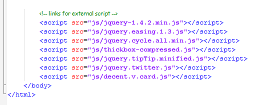
· 99% of code should be housed in external javascript files. They should be included at the END of the BODY tag for maximum page performance.
· Don't use document.write().
· All Boolean variables should start with "is".Test for positive conditions
1.isValid = (test.value >= 4 && test.success);
· Name variables and functions logically: For example: popUpWindowForAd rather than myWindow.
· Don't manually minify. With the exception of the traditional i, etc. for for loops, variables should be long enough to be meaningful.
· Constants or configuration variables (like animation durations, etc.) should be at the top of the file.
· Strive to create functions which can be generalized, take parameters, and return values. This allows for substantial code reuse and, when combined with includes or external scripts, can reduce the overhead when scripts need to change. For example, instead of hard coding a pop-window with window size, options, and url, consider creating a function which takes size, url, and options as variables.
· Comment your code! It helps reduce time spent troubleshooting JavaScript functions.
· Don't waste your time with <!-- --> comments surrounding your inline javascript, unless you care about Netscape 4. :)
· Minimize global variables - the less globals you create, the better. Generally one, for your application namespace, is a good number.When specifying any global variable, clearly identify it
1.window.globalVar = { ... }
White-space
In general, the use of whitespace should follow longstanding English reading conventions. Such that, there will be one space after each comma and colon (and semi-colon where applicable), but no spaces immediately inside the right and left sides of parenthesis. In short, we advocate readability within reason. Additionally, braces should always appear on the same line as their preceding argument.
Consider the following examples of a JavaScript for-loop...
Correct
1.for (var i = 0, j = arr.length; i < j; i++) {
2.// Do something.
3.}
Incorrect
1.for ( var i = 0, j = arr.length; i < j; i++ )
2.{
3.// Do something.
4.}
Also incorrect
1.for(var i=0,j=arr.length;i<j;i++){
2.// Do something.
3.}
plugins.js and script.js
Starting with H5BP we're presented with two files, plugins.js and script.js. This section outlines basic usage of these two files.
plugins.js
Plugins.js is meant to hold all of a sites plugin code. Instead of linking to many different files, we can improve performance by including plugin code directly in this one file. There can and should be exceptions to this usage. An extremely large plugin only used on one rarely visited page, for example, might be better off in a separate download, only accessed on the target page. Most of the time, however, it's safe to just paste in minified versions of all your plugins here for easy access.
Here's what an example file might looks like, including a small table of contents. This can serve as a handy guide for what plugins are in use, including URLs for documentation, rationale for use and the like.
01./* PLUGIN DIRECTORY
02.What you can find in this file [listed in order they appear]
03.
04.1.) Animate Background Position - http://plugins.jquery.com/project/backgroundPosition-Effect
05.2.) jQuery Easing Plugin - http://gsgd.co.uk/sandbox/jquery/easing/
06.3.) jQuery Ajax Form plugin - http://jquery.malsup.com/form/#download
07.4.) jQuery validation plugin (form validation) - http://docs.jquery.com/Plugins/Validation
08.-password strength
09.5.) Styled Selects (lightweight) - http://code.google.com/p/lnet/wiki/jQueryStyledSelectOverview
10.*/
11.
12./**
13.* 1.) Animate Background Position - http://plugins.jquery.com/project/backgroundPosition-Effect
14.* @author Alexander Farkas
15.* v. 1.21
16.*/
17.(function($) {
18.if(!document.defaultView || !document.defaultView.getComputedStyle){ // IE6-IE8
19.//SNIPPED
20.};
21.})(jQuery);
22.
23.
24./**
25.* 2.) jQuery Easing Plugin (we're not using jQuery UI as of yet) - http://gsgd.co.uk/sandbox/jquery/easing/
26.*/
27.
28.// t: current time, b: begInnIng value, c: change In value, d: duration
29.jQuery.easing['jswing'] = jQuery.easing['swing'];
30.
31.jQuery.extend( jQuery.easing,
32.{
33.//SNIPPED
34.
35.});
36.;(function($) {
37.$.fn.ajaxSubmit = function(options) {
38.//SNIPPED
39.}
40.})(jQuery);
41.
42./*
43.* jQuery Styled Select Boxes
44.* version: 1.1 (2009/03/24)
45.* @requires jQuery v1.2.6 or later
46.*
47.* Examples and documentation at: http://code.google.com/p/lnet/wiki/jQueryStyledSelectOverview
48.*
49.* Copyright (c) 2008 Lasar Liepins, liepins.org, liepins@gmail.com
50.*
51.* Permission is hereby granted, free of charge, to any person obtaining a copy
52.* of this software and associated documentation files (the "Software"), to deal
53.* in the Software without restriction, including without limitation the rights
54.* to use, copy, modify, merge, publish, distribute, sublicense, and/or sell
55.* copies of the Software, and to permit persons to whom the Software is
56.* furnished to do so, subject to the following conditions:
57.*
58.* The above copyright notice and this permission notice shall be included in
59.* all copies or substantial portions of the Software.
60.*
61.* THE SOFTWARE IS PROVIDED "AS IS", WITHOUT WARRANTY OF ANY KIND, EXPRESS OR
62.* IMPLIED, INCLUDING BUT NOT LIMITED TO THE WARRANTIES OF MERCHANTABILITY,
63.* FITNESS FOR A PARTICULAR PURPOSE AND NONINFRINGEMENT. IN NO EVENT SHALL THE
64.* AUTHORS OR COPYRIGHT HOLDERS BE LIABLE FOR ANY CLAIM, DAMAGES OR OTHER
65.* LIABILITY, WHETHER IN AN ACTION OF CONTRACT, TORT OR OTHERWISE, ARISING FROM,
66.* OUT OF OR IN CONNECTION WITH THE SOFTWARE OR THE USE OR OTHER DEALINGS IN
67.* THE SOFTWARE.
68.*
69.*/
70.
71.jQuery.fn.styledSelect = function(settings) {
72.//SNIPPED
73.return this;
74.};
Script.js
Script.js is meant to hold your site or application code. Again, this isn't always the best solution as larger teams and or larger, more feature rich projects can really benefit from breaking out application code into module or feature specific files. For smaller sites, simpler applications, and initial prototyping, however, dropping your work into scripts.js makes sense.
01./* Name: Demo
02.Author: Demo King */
03./*demo namespace*/
04.demo = {
05.common : {
06.init : function(){
07.//initialize
08.},
09.finalize : function(){
10.//finalize
11.},
12.config : {
13.prop : "my value",
14.constant : "42"
15.}
16.},
17.mapping : {
18.init : function(){
19.//create a map
20.},
21.geolocate : function(){
22.//geolocation is cool
23.},
24.geocode : function(){
25.//look up an address or landmark
26.},
27.drawPolylines : function(){
28.//draw some lines on a map
29.},
30.placeMarker : function(){
31.//place markers on the map
32.}
33.}
34.}
Variables, ID & Class
All JavaScript variables shall be written in either completely lowercase letter or camelCase. The one exception to this are Constructor functions, which are capitalized by tradition. All id and class declarations in CSS shall be written in only lowercase. Neither dashes nor underscores shall be used.
Event Delegation
When assigning unobtrusive event listeners, it is typically acceptable to assign the event listener directly to the element(s) which will trigger some resulting action. However, occasionally there may be multiple elements which match the criteria for which you are checking, and attaching event listeners to each one might negatively impact performance. In such cases you should use event delegation instead.
Debugging
Even with the best of validators, inevitably browser quirks will cause issues. There are several invaluable tools which will help to refine code integrity and loading speed. It is important that you have all of these tools available to you, despite the browser you primarily use for development. We recommend developing for Firefox and Safari first, then Google Chrome and Opera, with additional tweaks via conditional comments just for Internet Explorer. The following is a list of helpful debuggers and speed analyzers...
Patterns for better JavaScript
· Writing Maintainable Code
· Single var Pattern
· Hoisting: A Problem with Scattered vars
· (Not) Augmenting Built-in Prototypes
· Avoiding Implied Typecasting
· Avoiding eval()
· Number Conversions with parseInt()
· Opening Brace Location
· Capitalizing Constructors
· Writing Comments
· Avoid void
· Avoid with Statement
· Avoid continue Statement
· Avoid Bitwise Operators if possible
Accessibility
— Interfaces developed by Isobar should meet Section 508 standards.
— Interfaces developed by Isobar should meet Priority 1 guidelines.
Performance
As we continue to push the limits of what the web can do, it remains just as important a web page can be used with minimal effort or wait time. The following section explains how web pages can be optimized to keep all audiences happy.
Optimize Delivery of CSS and JavaScript
There are many optimizations that should be done for serving CSS and javascript in Production:
· Smush images using smush.it. Also using YSlow can autosmush all your images for you. · Set caching headers appropriately.
· Consider a cookie-less subdomain for static assets
· Avoid inline <script> blocks.
· CSS should be located in the <head> of the document, Javascript should be right before the </body>tag.
· Both CSS and JavaScript should be served minified. Most people use the YUI Compressor for this. · CSS should be concatenated together. Obviously this can only be done for files that share the same media type (e.g. screen or print). The general goal here is to reduce the number of HTTP connections to dependencies during the loading of the page.
· JavaScript should be concatenated. While a ajax script dependency manager would be ideal (similar to the YUI 3 Loader), it's rather complicated to implement. In its place I'd recommend a singular download of most of the script used on the site. (Of course, proper caching should be used to retain the file as long as is reasonable).
· Concatenation and minification typically occur during an automated build process, when packaging the code for deployment on stage or production. Many use tools like Ant or Maven for this. · Avoid inline <script> blocks within the HTML. They block rendering and are quite devastating to page load time.
Optimize JavaScript execution
During a page load, there is typically a lot of script waiting to execute, but you can prioritize it. This order prioritizes based on user response:
1. Script that changes the visible nature of the page needs to fire absolutely first. This includes any font adjustment, box layout, or IE6 pngfixes.
2. Page content initialization
3. Page header, topnav and footer initialization
4. Attaching event handlers
5. Omniture, Doubleclick, and other 3rd party scripts
Leverage CSS Sprites
CSS Sprites basically take a number of image assets and merge them together into a singular image file. Each part of it is revealed using CSS background-position. Some typical CSS would look like:
1.a.expandbox { display:block; width: 75px; height: 15px; text-indent: -999px; overflow:hidden;
2.background: url(../img/sprite.png) no-repeat -50px -5px; }
It's quite common to leverage sprites for :hover states. In that case you'll see something like:
1.a.expandbox:hover { background-position: -50px -20px; }
Many developers use a vertically-oriented sprite in addition to the primary sprite. This vertical sprite will be <=100px wide (and tall) and contain icons that are typically placed next to text, such as list item bullets. Yahoo uses a few such as this one. Image formats
There are four main image formats that should be used, detailed here:
1. JPEG. - This will cover all photography-based images, such as homepage and category page promo images, or anything with a very high color count.
2. PNG24. This format, easily accessible in Photoshop, outputs high-color count imagery and fully supports graded opacity by pixel. Relatively, it's quite a heavy format as far as kilobyte weight. It is the only format that IE6 needs to execute a pngfix on. In that case, Isobar recommends the DD_belatedPNG script (A pngfix fixes the issue where PNG24's appear to have a gray or light-blue background in IE6. They are not always compatible with background-position). In many cases, you can use a GIF fallback for IE6, in place of a PNG24. This is especially true if any sprites need to be done in PNG24. All pngfixes are very slow and expensive, so it's best to avoid using them.
3. PNG8. - A surprising diversity of color can be captured inside 256 colors, so it's worth trying PNG before heading JPG. PNG also is a lot more compressible than GIF (using tools like pngcrush and pngquant). This format allows graded opacity in nearly all browsers, but in IE6, those semi-opaque pixels are just shown 100% transparent. In many cases this is sufficient. It also does not require a pngfix script to be run, so it's optimized for speed.
4. Transparent GIF 89a. - GIF 89a offers the flexibility of transparency and wide browser support, but the constraints of no graded opacity nor a color depth above 256. In our experience, color depths of 64 still provide very good quality thumbnails, and keep the file size comparably very small.
All low-color count imagery such as icons or thematic graphics should be done in PNG8, as it's the most size-efficient of these four. PNG8 is our primary recommendation for most site graphics.
For further optimization all of these formats, taking them through Yahoo's Smush.It will reveal how they can be smaller. Caching
For static content, the browser should cache the file locally as long as is reasonable. Content that should have far future caching includes:
· CSS and JavaScript
· product images
· thematic graphics
· favicon.ico
· flash .swf's
· promo images (lighter caching likely)
For the best caching, leverage the Expires http header. This is a far future Expires header, telling the browser that this response won't be stale until April 15, 2015.
Expires: Thu, 15 Apr 2015 20:00:00 GMT
If your server is Apache, use the ExpiresDefault directive to set an expiration date relative to the current date. This example of the ExpiresDefault directive sets the Expires date 1 year out from the time of the request.
ExpiresDefault "access plus 1 year"
Expires http header should be set to a value between one month from present to a year (far future) from present. Caching only applies to that exact URL, so a change in the filename of any asset will start a fresh copy. Many developers use a build process to add a version number or timestamp to their assets. Each subsequent build will start a brand new cached version, allowing you to use far future cache dates without worry. Google has a lot more detail on browser caching. Shard resources across domains
Static content should certainly be served from a domain different than the one that serves HTML. This is optimal so that there are no extra cookies headers on all static content requests. It's also much easier to write caching rules for the entire domain. (Also any subdomains of the current domain will inherit domain cookies, so it's worth using a completely new domain). However with enough assets (especially images) the number of requests grows enough to slow down the load of the page. Many browsers have a low constraint of how many assets they will download simultaneously per domain. (In IE6 and 7, it's only two). In this case, we can serve the assets from multiple subdomains such as:
· static1.otherdomain.com
· static2.otherdomain.com
· static3.otherdomain.com
Avoid IFRAMEs
Iframes are the most costly element to add to a given page. They block the page from firing the onload event until they are complete. Sometimes they are useful to let another agency handle tracking scripts. For example the Doubleclick floodlight tag is an iframe, and the admin can add tracking pixels into it from their dashboard. In any case where an iframe is added, it should be appended to the DOM dynamically after window onload has fired. More detail at Yahoo's Performance site. 3rd Party Integration
Omniture
We recommend to add the Omniture JavaScript code to the DOM using JavaScript after the page has loaded (either a DOM ready event or window's load event). Using this technique, there is no external domain script dependency, which can slow down (and potentially hang) a page load.
Flash
Backup HTML content should be in place of the flash in all cases to maximize SEO value. For XML-driven flash, the backup HTML content should be leveraging the exact same XML file, to ensure data consistency.
All replacements should be done using SWFObject but without inline script tags. SWFObject initialization should fire after the DOM Ready event. Minimum player version should be set to minimum v9, to ensure AS3 compatibility.
Cross-Browser Performance Strategy
There are two major truths when it comes to in-browser experience:
1. Everyone wants the most responsive experience possible.
2. Everything added to the page slows it down.
So with these two facts of life, what steps do we need to take so everyone is happy?
Create success metrics with the client
These should be customized to your client and project and done before the wireframing phase. These goals should be reasonable from a technical POV, as well as testable.
Some goals that would be appropriate:
1. The slowest browser supported must go from an empty cache to fully loaded and initialized within 5 seconds.
2. Hover states (and other 'instant' changes) should respond within 100ms.
3. Animations should appear smooth, with jumpiness occurring < 15% of the time (across all browsers).
For load-time based goals, it's important to define the benchmark system. Something like PageTest is a good option. Additionally, goals may be defined for multiple pages, for example: the two most popular landing pages (e.g. homepage and support). If the client has more aggressive goals than are reasonable with the intended design, expectations need to be set across the board, priming the team that performance goals are going to be paramount.
Communicating the performance impact during design phase
Internally
During IA, IxD, and visual design, it is the front end engineer's role to communicate the performance impact of interactive features or certain visual techniques on the target browsers. Give the designers constraints: "If we're using Cufon, we cannot have more than 10 elements of custom font per page."
Externally
Expectations need to be set that all browsers will not have the same experience. They won't perform as well as each other, nor may it make sense to have feature parity. It may be sensible to drop a few features from the IE7 experience. Features that could be considered to be dropped are: shadows, transitions, rounded corners, opacity, gradients.
When communicating the impact of something:
· Clarify the impact with as much detail as possible: "it will hurt page load" vs "it will add 2 seconds to page load in IE"
· Provide a quick POC (proof of concept) if it's reasonable: "This similar-looking page without siFR loads in 2 seconds, with siFR it loads in 8 and has a delay to show during scrolling"
Develop according to best practices
Choose libraries and plugins that are performance optimized. Make wise architecture decisions based on performance goals. Also minimize DOM manipulation when possible, and write styles to avoid visual changesto the page as it loads and initializes. Measure performance during QA
QA teams should also prioritize performance related tickets alongside visual, functional, and usability issues. Developers and QA should determine how that priority will be assigned. During QA, the success metrics should be tested regularly.
Tools to test with
When performance goals aren't met, there are three options:
1. Redevelop the code - profile, discover bottlenecks, refactor code, optimize to target faster execution in the browser
2. Drop the feature - turn it off for slower browsers only
3. Redesign approach of the UI - perhaps the design could use a tweak which would bypass the issue entirely
With this approach, we think all parties have a better chance of having aligned expectations heading in as well as a more sensible workflow in dealing with performance challenges.
Browser Testing and Support
Today's audience can choose from quite a large pool of web browsers, each providing a slightly (or dramatically) different experience. As developers, it is our responsibility to choose just how the web pages we build are displayed to those users. This section describes how we, at Isobar, make some of these key decisions.
What we support
Isobar supports any browser with an A-Grade in Yahoo's Graded Browser Support, with the exception of Opera. There may be exceptions to this, given regional markets and their particular metrics. We will strive to support any other mission critical browsers mandated by the client (IE 5.5, Opera, Konqueror, Safari 3 on PC, etc), though we cannot guarantee all functionality is possible.
How we test
Comprehensive browser testing is a must on every Isobar web project. Considerable effort must be made to test across browsers and platforms to ensure a quality and consistent user experience. Setting up a testing environment can be a challenge but can be well worth it.
On Microsoft Windows
IE Testing
Since it's impossible to have more than a single copy of Microsoft Internet Explorer installed on a PC, testing for IE is a challenge. Fortunately, Microsoft has finally made available development versions of older Internet Explorer's available for downloading. These Virtual Hard Drives (VHD's) run stripped down versions of Microsoft Windows that expire (time out) over time. Setting them up again after a few months is typically required. Development copies of Microsoft Windows from your MSDN license (if available) may also be an option depending on what you have access to.
· Virtual PC - Virtual PC must be installed on your computer, and if you are on Windows 7, you must use "XP Mode". · Microsoft Windows VPC Images - Several varieties are available of the virtual hard drive images. You may need to install several to have a comprehensive test suite, depending on your project. Firefox
Safari for the PC
Opera
Google Chrome and Chrome Versions
Google Chrome updates itself and as luck would have it, most all users have the most recent version more often than not. If only every browser were this easy. No worries about old browsers based on Google Chrome.
On Mac OS X
For the core Mac OS X browsers, Mozilla Firefox, Google Chrome and Apple Safari offer virtually identical browser experiences to their Windows counterparts. That said, some OS level differences can be present and web sites should be tested on both platforms. Typical differences are around font rendering and thus spacing issues sometimes arise.
Testing for Windows on a Mac
There are a number of options for testing Windows-based browsers on the Mac OS. First, Mac computers offer a "boot camp" partition which allow you to boot the Mac into a Microsoft Windows partition. This is a complex yet thorough testing environment. Once you've booted to Windows, the normal Windows options exist. Other options include virtualization of Windows inside Mac OS X, which allows you to literally run Windows inside of the Mac OS.
The Microsoft VHD's can be opened or converted on most of these options, therefore enabling the same degree of testing prowess that Windows users have available to them. Though since you can also test on the Mac simultaneously, some might argue you have more flexibility... · Parallels - Parallels is available and may already be installed by the Isobar IT department on your Mac. · VMWare Fusion - VMWare Fusion offers the same level of Windows virtualization through their Fusion product. Mozilla Firefox
Just like on Windows, you can install and run multiple copies of Mozilla Firefox on a Mac, though it is a bit trickier to set up multiple profiles via the Profile Manager. That said, there are some tricks you can use withAutomator to make separate profiles and run them nicely. Bugs in standalone IE versions
Note: The IE6 standalone has a buggy implementation of opacity in some cases. This will result in any opacity applied with a CSS filter, like alpha opacity or a 24-bit PNG, to fail. In the case that opacity must be tested, you will need a native IE6 installation.
It has been noticed that IE 7 using the Vista platform does have differences from IE 7 on Windows XP, therefore, you might want to make sure that someone on your team has this configuration as well. IETesteris known to fix a number of these issues, as do the Xenocode browsers. Browser Resolution
Along with catering to browsers, developers must stay conscious of the screen resolutions of their audience. As monitor screens get larger, the breadth of resolutions grows as well. Below are some guidelines to help you in working with resolutions.
1024px resolution
· Fold estimated at 570px.
· Optimal width: 960px - Has comfortable padding on both sides, is divisible by many numbers, and also plays well with IAB ad standard widths · Larger width: 970px - Still has some padding on both sides in most browsers. The math plays well with the Golden Ratio · Maximum width: 996px - Without incurring any horizontal scrollbars in the major browsers. Based on the research here the maximum is 1003 px wide if you don't want a horizontal scrollbar. Current stats on window sizes
System resolution is not, however, the same as browser size
Search Engine Optimization
An essential part of good web design and development is SEO. Well-structured code is the key to ensuring that a web page not only gets properly indexed by search engines, but made accessible to those with limited web capabilities as well.
Be aware of SEO best practices
· Be aware of Accessibility best practices, such as the 508 and WCAG standards:
Indexability
We must use semantic markup that's readable and logical when JavaScript and CSS are off. All page content must be in HTML; we don't want to use iframes or JavaScript for loading initial indexable content.
All links should be to HTML destinations.
1.<a href="/shelf/jordan/page/2">
Instead of
1.<a href="javascript:loadPage(2);">
This lets the page get indexed correctly by search engines as well as allows users to open in new tabs and windows.
Optimization
The title tag should feature target keywords for the unique page. The titles should be unique to each page. Headings (h1,h2,etc) should form an outline of the document and represent the most important keywords for that page. URLs should be human-readable with primary target keywords present in them:
http://domain.com/mens-shoes/basketball/jordan/jordan-mens-ajf-6-basketball-shoe/
vs
http:// domain.com/ecomm.cfm?view=prod&prodId=23425
Flash and Image Replacement
Always use backup HTML content for flash. All promo images should use CSS-based image replacement instead of alt tags.
>Fallback non-flash version:
1.<a href="/nike/morethanagame/" id="morethan">
2.<h4>Nike: More Than A Game</h4>
3.<h5>Experience the movement and view apparel</h5>
4.</a>
1.a#more than { background:url(/promos/nikegame.jpg) no-repeat; width: 200px; height: 100px;
2.text-indent: -999px; overflow:hidden; display:block; }
Google's SEO Report Card
Google's SEO Report Card is an effort to provide Google's product teams with ideas. on how they can improve their products' pages using simple and accepted optimizations. These optimizations are intended to not only help search engines understand the content of their pages better, but also to improve their our users' experience. when visiting their sites. Simple steps such as fixing 404s and broken links, simplifying URL choice, and providing easier-to-understand titles and snippets for their pages can benefit both users and search engines.
Code Reviews
A code review is the cornerstone of the formal process for ensuring the quality of user experiences developed by the Creative Technology team. This involves a meeting among authors of markup, reviewers and other stakeholders, with expected input and subsequent code revisions. Simply put, we encourage conducting code reviews to keep our tools sharp and clean.
Why should I have a code review?
Code reviews are a strategic investment of time to mitigate risk on a project.
Often times, interface developers are asked to author markup from wire frames or visual compositions. However, its possible that screens that are designed cannot be translated to markup easily, or without compromising quality. Code reviews provide an opportunity for this risk to be addressed and resolved before full production of pages begins.
Code reviews increase the overall level of knowledge across projects
Since code reviews involve members from within and outside a project team, techniques and best practices are easily shared throughout the entire Creative Technology team.
Code reviews eliminate bugs before they are reproduced from a few templates into multiple pages
Ideally, code reviews are conducted early in the development process, before full production of pages begins. When templates are reviewed by the team and run through multiple validation tools and browsers, bugs can and will appear. This is the ideal time for bugs to be fixed.
Code reviews give a set of fresh eyes an opportunity to spot issues with code
Reviewers from outside a project team can spot issues with code more easily than authors of markup, who have been working with code for a longer amount of time.
Who should participate in a code review?
Ultimately, the front end engineering Lead on a project is required to ensure that proper code review procedures are followed.
Ideally, a practice lead should act as facilitator for a code review session, unless the practice lead is also the interface developer whose code is under review. In this situation, a project manager can be brought in as a facilitator.
The review team should include at least two senior members of the Interface Technology team versed in development and best practices.
What is required for a code review?
Before a code review is conducted, templates to be reviewed must be fully developed, validated, and tested against the browsers and platforms required by the project.
A practice lead and/or interface developer must distribute the following 48 hours prior to the date of the code review:
· Code for all pages, associated server-side includes, CSS, and JavaScript. These should be fully commented, printed out with line numbers along the left side, and the file/page name in the footer of each printed page.
· Screenshots of each template
· URLs of the templates, if applicable
· A list of browsers and platforms supported by the project
· A list of known issues/areas of concern
It is typical for code to be changed constantly until the code review is to take place. Unfortunately, this does not leave enough time for validation and testing. If this is the case, it is recommended that the code review be rescheduled to a date that ensures a proper code review.
In addition, a practice lead and/or interface developer should book a conference room and call-in number for all attendees, since it is possible that members of either the project or code review team are off-site. An hour should provide enough time for review of two or three templates; however, time will vary depending on the volume and complexity of the templates.
During the code review, a practice lead and/or interface developer should facilitate the meeting, while the practice lead or project manager takes notes and assigns action items. Reviewers should have reviewed the code and come prepared to ask questions or provide feedback.
Notes and action items (including owners) should be distributed to all attendees after the code review. If substantial changes come out of a code review, or all code is not reviewed, it may be necessary to schedule a second code review. However, this should be discussed amongst the project team to determine feasibility.
Appendices
Here are the references, tools and other things that relate to this document.
Appendix A: Validators
o Tests individual pages for accessibility against either the W3C or Section 508 standards.
o Similar to Bobby, tests individual pages for accessibility against either the W3C or Section 508 standards.
Appendix B: Tools
· BrowserCam - Displays how a web site will appear in most browsers (including versions) and operating systems. Code Editors
A great code editor can spark productivity in exceptional ways. Many developers prefer rudimentary text editors, others prefer powerful integraded development environments (IDEs). What follows is a general listing of some of the more well-known tools, it would be impossible to list them all.
Aptana
Aptana Studio is a powerful, free and open source Ajax development environment which runs stand-alone or within Eclipse. Aptana Studio offers tooling for Ajax including HTML, CSS, DOM, and JavaScript editing and debugging, plus support via additional free plugins for PHP, Ruby on Rails, Adobe AIR, Apple iPhone development. It also features full SVN repository integration for committing, branching, tagging, merging and repository browsing.Aptana. [Linux, Mac, Windows] Geany
Geany is a text editor using the GTK2 toolkit with basic features of an integrated development environment. It was developed to provide a small and fast IDE, which has only a few dependencies from other packages. It supports many filetypes and has some nice features. Geany. [Linux, Mac, Windows] Notepad ++
Notepad++ is a free (free as in "free speech", but also as in "free beer") source code editor and Notepad replacement, which supports several programming languages, running under the MS Windows environment. Notepad ++. [Windows] e TextEditor
E is a new text editor for Windows, with powerful editing features and quite a few unique abilities. It makes manipulating text fast and easy, and lets you focus on your writing by automating all the manual work. You can extend it in any language, and by supporting TextMate bundles, it allows you to tap into a huge and active community. e TextEditor. [Windows] Edit Plus
EditPlus is a text editor, HTML editor and programmers editor for Windows. While it can serve as a good Notepad replacement, it also offers many powerful features for Web page authors and programmers. EditPlus. [Windows] Homesite
HomeSite 5.5 provides a lean, code-only editor for web development. Advanced coding features enable you to instantly create and modify HTML, CFML, JSP, and XHTML tags, while enhanced productivity tools allow you to validate, reuse, navigate, and format code more easily. Configure Adobe (formerly Macromedia) HomeSite to fit your needs by extending its functionality and customizing the interface. Homesite. [Windows] TextMate
TextMate claims to be the "Missing Editor" for Mac OS X. A general purpose editor with a sparse interface, the real power is in it's extensibility. Features column selections, recordable macros, snippets, auto-pairing of brackets and other characters, clipboard history, code folding, tab-triggers, tabbed placeholders and mirror typing. And that's just for starters. Anything that can be done via scripts through the Mac command line can be done through custom commands, allowing an extremely high degree of customization and expansion of the feature set. TextMate's "bundle" format has been adapted by many other code editors including the aforementioned e TextEditor. TextMate. [Mac] Espresso
Espresso was created by the same fellow that created the innovative CSSEdit CSS editor. Espresso features syntax highlighting, code folding, code completion, document outliner/navigators, projects, powerful find features, and built-in file transfer publishing capabilities. Finally, it has a powerful "Sugar" feature set which allows the creation of custom commands and plugins. Espresso. [Mac] BBEdit
BBEdit is the grand-daddy of Mac code editors for web development. Features syntax highlighting, exceptionally powerful text manipulation tools, multi-file searches, a scriptable API, text clippings, and extensive Mac Automator features. BBEdit. [Mac] TextWrangler
The free "little brother" of BBEdit, it is a powerful raw text editor with a massive text manipulation feature set. Searches, regular expressions, text transformations, syntax highlighting and code navigation tools for a variety of different language environments.TextWrangler. [Mac] Coda
Coda from Panic software is a powerful IDE with code editing, terminal, remote file management, and help documentation all built into one UI. Aiming to be a one stop shop for your web development workflow, it also features SVN integration and a new plug-in builder with powerful scripting support and TextMate bundle importing. Finally, code clips and live multi-user editing are also supported. Coda. [Mac] UltraEdit
Another editor that's been around for ages, this is an immensely robust and powerful text editor, able to open files limited only by the amount of memory on your computer. The feature list is virtually too much to list, with a massive list of text manipulation features, project support, powerful search and replace, hex editing, function lists, a massive list of languages supported (600+) remote file ftp, telnet, ssh, file comparison, scriptable macros, tools and compiler support, and much, much more. UltraEdit. [Linux, Mac, Windows] Sublime Text
A relatively new editor, Sublime Text is a new approach in editors. "Open Anything" searches through file names and file contents, with remarkable efficiency. Incredibly powerful selection controls allow editing text in multiple locations at once and the "Minimap" gives you a bird's eye view of the open file so you can find your place easily. Actively being developed, new features are being added and the community around the editor is rapidly expanding. Macros, auto-complete, snippets, build tools, the list of features goes on and on. Supports Linux and Mac starting with version 2. Sublime Text. [Linux, Mac, Windows] Vim
If you have to ask, it's probably not for you. Vim [Linux, Mac, Windows] Google Chrome Extensions
Developer Tools
Not actually an extension for Chrome, but built right in (shares much with Safari's Web Inspector, both being derived from WebKit.) This suite of tools features a DOM inspector, basic JavaScript debugger, profiling tools, network loading inspector and timelines, page resources inspectors, and more. Developer Tools. code cola
A pop-up panel with CSS editing tools for examining and modifying the styles on a given page. code cola. Firebug Lite for Google Chrome
You really don't need to install an extension to use Firebug Lite with Chrome, though the extension is nice because it enables one-click application of the Firebug Lite script to any page you are working with. Not the full Firebug feature set, but close. Firebug Lite. HTML5 Outliner
The HTML5 Outliner adds a pop-up with a generated HTML5 outline of the current page's header hierarchy. Helps for checking your pages' organization against the new HTML5 header outlining algorithms. HTML5 Outliner. Pendule
Web Developer for Chrome
Chris Pederick, the original developer of the original Web Developer toolbar for Firefox has ported the majority of it over to Chrome. There you have it. Web Developer. Firefox Plugins
FireFTP
FireFTP is a free, secure, cross-platform FTP client for Mozilla Firefox which provides easy and intuitive access to FTP servers. FireFTP. Firebug
Firebug integrates with Firefox to put a wealth of development tools at your fingertips while you browse. You can edit, debug, and monitor CSS, HTML, and JavaScript live in any web page. Firebug. Firequery
FireQuery is a collection of Firebug enhancements for jQuery integrated into Firebug.Firequery. Firecookie
Firecookie adds cookie viewing, editing, and deletion to Firebug. Firecookie. CSS Usage
CSS Coverage is an extension for Firebug which allows you to scan multiple pages of your site to see which CSS rules are actually used in your site. CSS Usage. Greasemonkey
Allows you to customize the way a web page displays using small bits of JavaScript.GreaseMonkey. Web Developer Toolbar
JSView
Adds an item in the status bar that displays all external JavaScript and CSS files loaded on a given page. Allows you to click on and view the files and things like their URLs. Great way to pull file URLs to put into Charles for remote debugging. JSView. Live HTTP headers
When running, captures all HTTP traffic from the browser, which enables you to see what files are being requested as well as information about the requests and server responses.Live HTTP Headers. Quick Locale Switcher
A tremendous help when doing internationalization, Quick Locale Switcher allows you to change the locale sent along in the browser's user-agent HTTP header, telling servers to display content for you in other locales. Quick Locale Switcher. Screengrab
Screengrab sits in the Firefox status bar, allowing you to capture and copy or save screen shots of everything from selections of a web page to the entire page, even parts displayed "below the fold." Screengrab. Total Validator
Enables one-click access to sending your page through a markup validator. No better way to quickly check for missing or mismatched tags! Also available as a standalone application. Total Validator. Opera Extensions
Dragonfly is Opera's developer tool similar to Firebug. IE Plugins
CompanionJS, DebugBar, IE8 Dev tools.
Charles Proxy
Charles watches all requests and can tell you a lot of information about them. Also supremely useful is Map Local which lets you use a local file in place of a given URL (good for replacing a minified js with a full one). Fiddler
From the site: "Fiddler is a Web Debugging Proxy which logs all HTTP(S) traffic between your computer and the Internet. Fiddler allows you to inspect traffic, set breakpoints, and "fiddle" with incoming or outgoing data. Fiddler includes a powerful event-based scripting subsystem, and can be extended using any .NET language." Speedlimit
Speedlimit is a Leopard (works in snow leopard) preference pane for limiting your network bandwidth to one of a couple different speeds—768k DSL, Edge, 3G, and Dialup. Good for testing your lowest supported speeds or when you want to know how your app will function in real world speeds. Tutorials & Tools:
Icons
Appendix C: Resources
· Google - when in doubt, google it. · Too lazy? - let me google that for you then...


